The Beauty of Plain Text
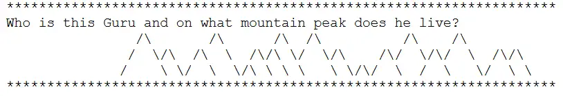
From The New Stack, David Cassel gives a brief history of ASCII art, including this mid-1920s Bauhaus wireframe that looks like it came out of Battlezone.

In the same way that drawings are more intimate than paintings, plain text has an immediacy that stylized, typeset formats lack.
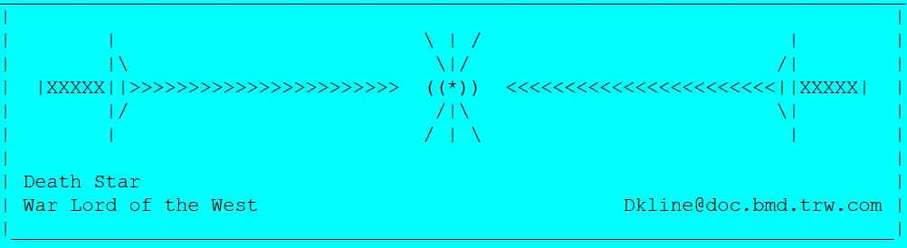
Because these Usenet sig blocks are made of nothing but raw characters, there is no ornamentation to obscure how the signatures were built. Every keystroke, including the pentimenti of stray letters, is recorded and on display, the way it was originally typed. Like the Pompidou Center, plain text exposes its own structure and reveals the design of writing. This adds a warmth to plain text files that reminds me of why Tom Hanks still uses typewriters:
You will need to make space for a typewriter and surrender the easy luxury of the DELETE key, but what you sacrifice in accuracy will be made up in panache. Don’t bother with correcting tape, white-out or erasable onionskin paper. There is no shame in type-overs or XXXXXXiing out a word so mistyped that spell-check could not decipher it. Such blemishes will become the personality of your typing equal to the legibility, or lack thereof, of your penmanship.
I do almost all of my writing and notetaking in plain text, using a combination of Emacs, evil, and org-mode. Uncluttered by styling, my .txt files feel like a pure, direct reflection of my thoughts. And because touch-typing with a modal editor encourages flow, writing in plain text is almost as freeform as notetaking by hand, so long as you invest the time to learn vim.